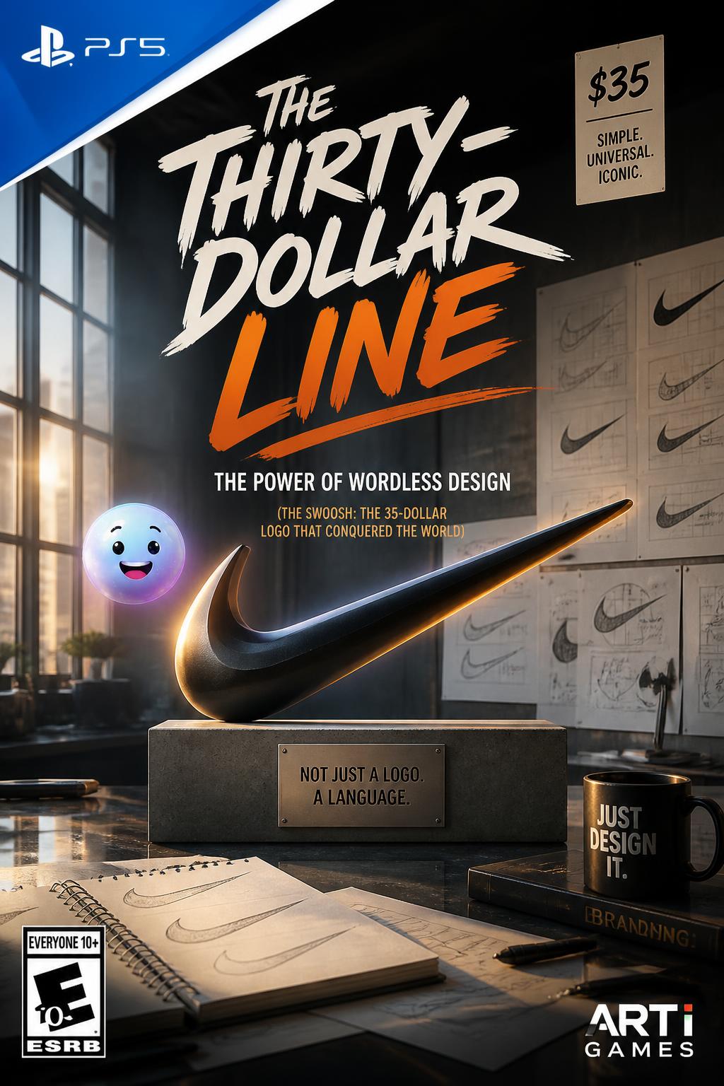
The thirty-five dollar doodle
Becoming a billionaire brand
The power of wordless design
The global cultural takeover
YOUR GOAL
Master of The scribble that ran away with the world

The wordless club: Nike is one of the very few brands globally that is legally trademarked by a symbol alone, without any letters.
A fluid, curved design resembling a checkmark that represents speed, motion, or a rushing sound. In 1995, Nike removed its written name, allowing the swoosh to stand alone as a global trademark.
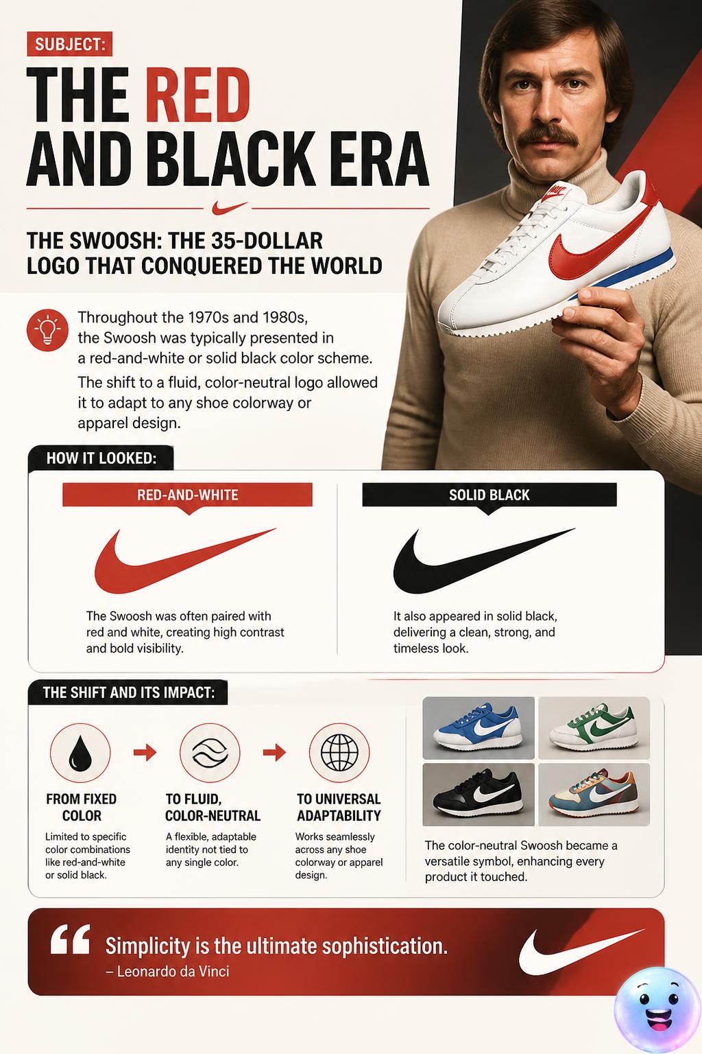
What did Nike's transition to a color-neutral Swoosh in the late 1990s allow the brand to do?
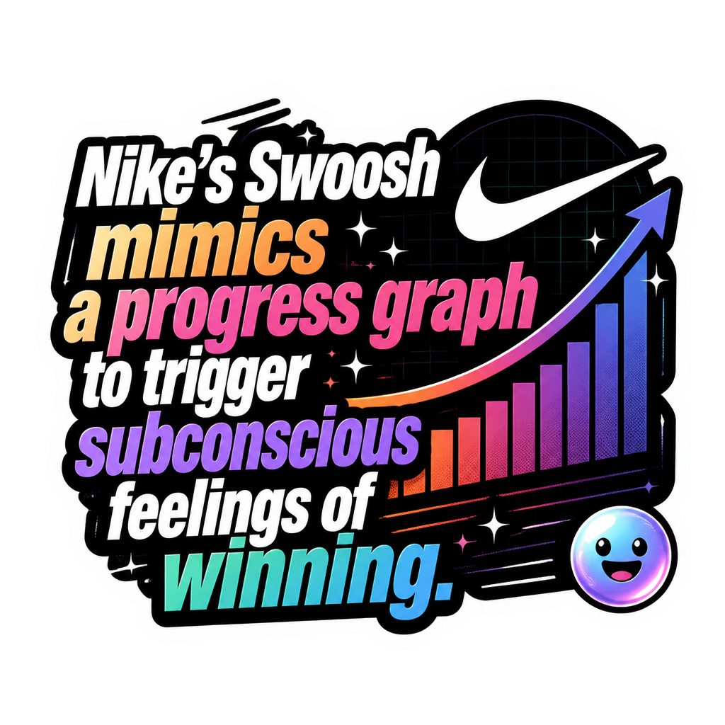
Why do visual psychologists believe the Swoosh's left-to-right upward curve feels positive to Western audiences?
In what year did Nike remove the text "NIKE" from its logo, leaving only the standalone Swoosh?
Which other global tech giant is famous for successfully using a wordless symbol as its main logo, similar to Nike?
What were the primary corporate colors of the Nike Swoosh logo throughout most of the 1980s?
What abstract feeling does the fluid, sweeping shape of the Swoosh design aim to trigger?