

BETA
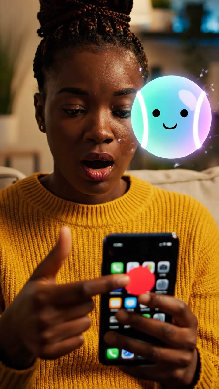
App designers use bright red for notification badges because the color triggers evolutionary alerts. In nature, red signifies danger, urgency, or ripe fruit, forcing the human brain to pay attention. This simple visual cue creates a mild sense of anxiety that is only resolved by opening the app.
futura The dark patterns of design
Just keep on scrollin', Never stoppin'. It's a design trick, keepin' your eyes locked in.

futura Automatically playing the next video removes natural decision points, keeping viewers watching longer.
The refresh lever: The 'pull-to-refresh' gesture, invented by Loren Brichter in 2009, was deliberately designed to mimic pulling a slot machine lever.

futura Tiny visual cues like bouncing icons and loading spinners are engineered to capture attention.
What is the purpose of a 'skeleton screen' (a blank layout placeholder) while a feed loads?
What is the design term for user interfaces designed to trick users into doing things they might not want to do?
What physical action does the 'pull-to-refresh' gesture mimic to trigger anticipation?